The D.A.T.A. Project
During the D.A.T.A. project, we were tasked with choosing a topic that we thought people could answer easily. We then compiled a list of five questions pretending to our topic and put them all on a digital survey. We then took the data from that survey and made it into different charts, tables, images, and factoids. We then put all these displays of data onto an infographic which we displayed at our 9th grade exhibition. We also learned about different types of data and charts/tables and how they're displayed throughout the course of the project. I felt that my final product came out pretty good but was annoyed because when my teacher printed it out some of the charts came out blurry.
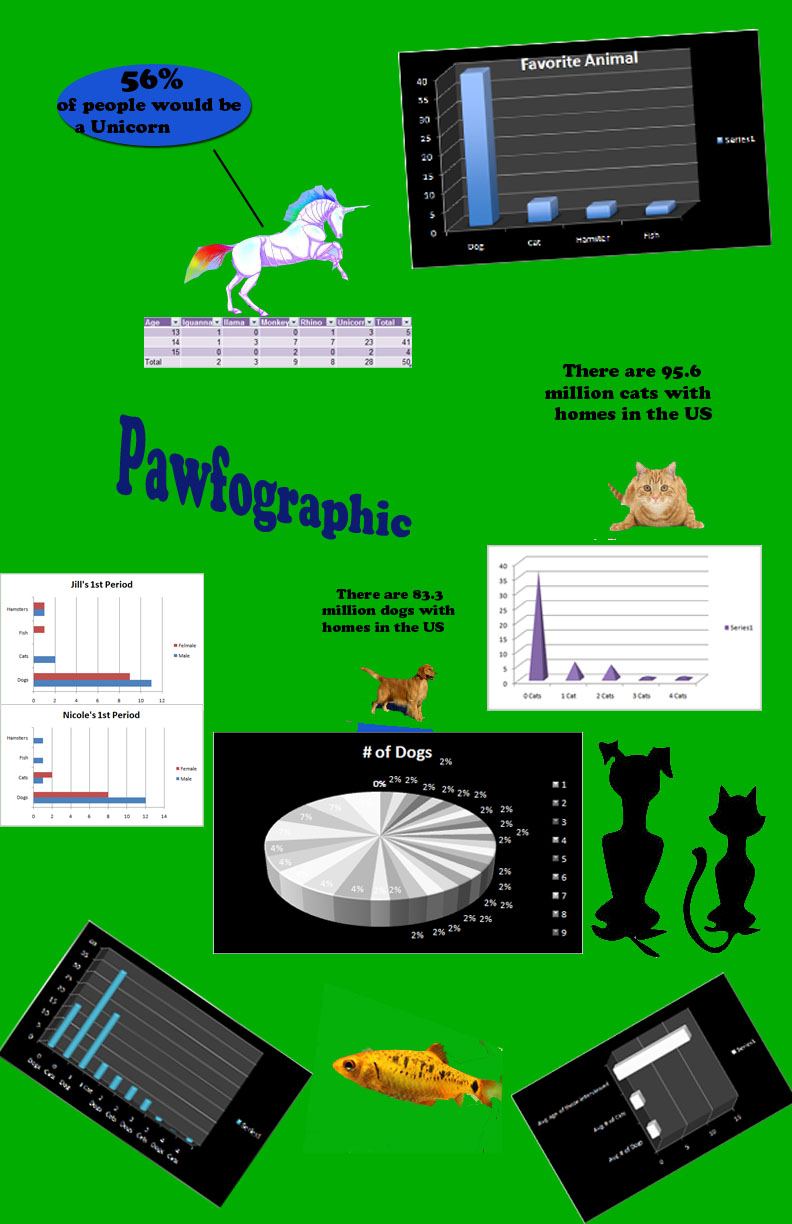
The topic of my info graphic was pets and animals. I put questions on the survey like, "How many pets do you have?" and, "How many cats and dogs do you have?" which helped me gather qualitative, quantitative, comparative, bivariate, and many other types of data.
| stephen_hymers_infographix_final_.jpg |
While making my info graphic, I discovered that the majority of my classmates liked dogs over cats. Another thing I found out was that less than 8 people on our entire team like cats. I have also come to the conclusion that 40 people on our team like dogs, and that 5 thirteen year olds, 41 fourteen year olds, and 4 fifteen year olds took the survey. I also concluded that more females like cats on our team compared to males.
